GREAT DAYS START
WITH GREAT COFFEE.
YEAR
2018
DELIVERABLES
Visual Identity
Label Design
TEAM
Celia
Juliana Reveiz
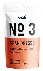
This project comprises a complete re-brand for Celia, a coffee label based in Munich. The idea was to create a label that could continuously welcome new combinations of grains and celebrate the variety of the original mixes in a minimal appearance.
LOCATION
Munich
A new generation of coffee drinkers.
CHALLENGE
The Celia team shared with me the labels that were originally designed by the founders of the company when they had just started to project. Although they served the purpose of identifying the different mixes, these were not causing the visual effect the company wanted to achieve with their products.
PREVIOUS DESIGN GIVEN BY CLIENT


PROCESS
Given that the color palette initially had two very similar colors, I tried to re-develop the proposal, keeping the original essence but aiming for a more diverse palette. With these tones in mind, I developed six different label proposals for Celia, and let the client decide which one best adapted to what they had imagined for the brand.

TYPOGRAPHY
KELPT SANS MEDIUM
KELPT SANS REGULAR
COLOR PALETTE
#FBD343
#91A6A7
#F18B69
#71BB74
This was the design selected by Celia
INITIAL PROPOSALS

IN COFFEE WE TRUST
SOLUTION
The result was a complete logo re-design and a label that worked on all the other designs, dividing their mixes and making them stand out on the supermarket shelf.


